
BACKGROUND
Quiet Lightning, a Bay Area literary nonprofit, produces a monthly submission-based reading series, performed live by the authors, published in a book handed out to the first 100 people at each show (entitled sPARKLE & bLINK), filmed and loaded online.
While Quiet Lightning already has a generally functioning site built off a standard Wordpress template, they are looking for is an improvement in usability, discoverability and visual design. It should also support its need to be financially sustainable in the future.The website serves to announce the upcoming shows and calls for submissions, as well as to provide an archive of all previous shows. It also provides pathways for people to get involved.
GOAL
Improve the usability, discoverability and visual design of the website of a Bay Area literary nonprofit, Quiet Lightning
TARGET AUDIENCE
- Writers who submit work to Quiet Lightning
- Fans who attend the events
MY ROLE
User Research, Interaction Design, Branding, Visual Design and UI Design
Project Duration: 80 hours
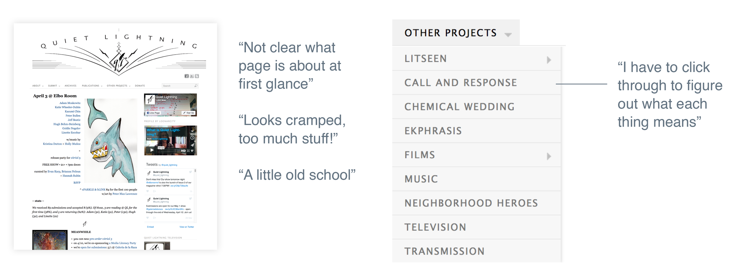
Quiet Lightning's current website:

PROCeSS


UNDERSTAND
Competitive Analysis
Market Research
User Interviews
DEFINE
Product Roadmap
Storyboards
User Persona
Sitemap
User Flows
IDEATE
Responsive Wireframes
Prototypes
User Testing
VISUAL DESIGN
Logo and Icon Design
Style Guide
Key Screen Templates

UNDERSTAND
While the Quiet Lightning team had shared how they felt about the current site, we had to validate these assumptions by finding out key users’ thoughts are about the site – the writers who submit to the shows, and fans who attend events.
I spoke to and observed how the following people used the Quiet Lightning site:
- Three writers who have previously submitted and participated in Quiet Lightning events
- Three arts events lovers who have never heard of Quiet Lightning
I also conducted an inventory of sites with similar requirements such as The Moth, Storycorps, Ploughshares, TED, and Heart and Stroke Foundation. From this I gathered that:
- Discoverability: QL will face the challenge of improving its discoverability through more enticing elements on the page, while keeping it easy to understand and digest at a glance.
- Visuals: QL definitely lags far behind similar sites in terms of brand strength and consistency.
- Financial sustainability: The QL site needs to make donating more prominent on its page and also tell a compelling story why people need to donate.

define
Next, we developed user personas, storyboards and a product roadmap to drill down to the core features to focus on.


Key insights:
- QL’s communications with writers, such as emails informing them when they are accepted/rejected and event reminders, is a key touchpoint.
- Users are constantly being redirected to external sites and likely don’t spend a lot of time on the actual site.
- It’s pretty unclear how to watch / view previous shows. “archives” and “sparkle and blink” are in separate sections, which may be confusing since the show and book go together.

IDEATE
We developed sitemaps, user flows and wireframes based on our problem definition.
Here's the original sitemap:


We developed responsive wireframes to specifically maximize usability, discoverability, and financial sustainability.
For the Homepage:
- A subtitle under the logo and quote on the hero image so users immediately know what the page is about
- A prominent donate button to support its financial stability
- Most crucial information, the latest event info, is one of the first things on the page
- Past shows and issues are brought to the fore to improve discoverability

For the Past Shows Page
- Drop-down menu by date, author and theme in past shows sub-menu to again make it as easy as possible to drill down and find content

For the Playlist Page:
- Selected tags to give the user a sense of place
- Current video highlights author and their page links for greater discoverability
- Related content is below main content to allow greater discoverability as well

This mid-fidelity desktop and mobile prototypes was tested on four potential visitors to the site.
- Testers were able to quickly gather what site was about easily from subtitle “the literary mixtapes” and the large quote on the main hero image. There was some questions / uncertainty about the image placeholders as the content is very image heavy.
- All four testers felt the site made them want to click around and discover content.
- Some testers found the main event and past show/publication items area slightly confusing, and thought it looked blog like laid out next to each other. They preferred the simpler, stacked mobile version.
- Most testers found submenu names slightly confusing still and could be more direct.
- There was a 100% completion rate for the tasks asked to complete (involving viewing specific content)
Based on this feedback, we revised the "Discover" section of the sitemap:


VISUAL DESIGN
Quiet Lightning (definition): the moment between a reader finishing up and applause erupting from the crowd, in the same way that mystical texts refer to the pause between inhaling and exhaling.
Look and feel: A blend of quirkiness and kitsch, with an old school, “smell of old books” vibe. At the same time, site design shold not overwhelm content.
Quirky | curious | supportive | welcoming

From the feedback received during the usability tests we improved the prototype screens that the participants had issues with, and then created the final screen designs for the Quiet Lightning site.

OUTCOME
We created a hi-res prototype based upon feedback from a final round of usability tests. The four new potential users tested found the site a lot more easy to grasp and use on first glance, liked the look and feel and found it appropriate, and found it much easier to discover new content.
“The overall layout is very clear”
“I like all the images, it draws me in”
“The menu items are pretty fool-proof”
CONCLUSION
Based on user testing, the site has now much improved usability (more intuitive information architecture and navigation items), discoverability (much more content is more easily accessible and discoverable to visitors, which was previously hidden, and easily filtered and drilled down to) and financial sustainability (donate button is now much more prominent on page, Kickstarter like feature that shows funds tracking on main Get Involved page).
In retrospect, some challenges included balancing needs of new vs current users for the main navigation, and balancing the needs of the organization vs those of user e.g. team wanted to incorporate more of social media feeds, and integrate other content, but these may not be helpful to users’ key goals and potentially add more clutter.
The next stages based on the product roadmap devised with the Quiet Lightning team are donor cultivation / fundraising capability, and integrating their sister events site, Litseen. Adding and balancing these different features while not imposing on the core requirements of the original site will be an exciting challenge.