
BACKGROUND
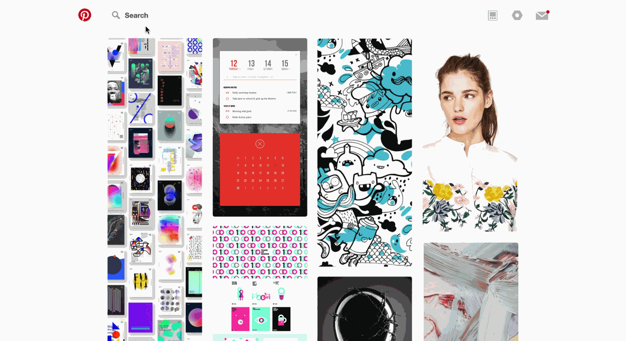
Pinterest has a broad audience looking to gather visual inspiration and ideas: recipes, parenting hacks, style inspiration and more. Compiling inspiration in a clear and accessible and enjoyable way is incredibly important for me as a designer. I find Pinterest’s user interface frustrating, and have yet to find a good replacement for it. Ironically, one of Pinterest’s core values is “Put Pinners First”: speaking to user-centered design.
Convinced I wasn’t alone in my frustrations, I wanted to go out into the world and see what other creatives thought, which is why I was so compelled to make its experience better.
ASSUMPTION
Pinterest has powerful search algorithms, but based on my own use of Pinterest and that of fellow users, needs improvement in its overall user experience.
MY ROLE
User Research, Interaction Design, UI Redesign
Project Duration: 70 hours
PROCESS


UNDERSTAND
Market Research
Competitive Analysis
Observational Inquiry
Surveys
DEFINE
Product Roadmap
Affinity Map
Storyboards
User Persona
User Flows
IDEATE
Wireframes
Prototypes
User Testing
VISUAL DESIGN
Icon Redesign
Key Screen Templates

UNDERSTAND
I needed to:
- Conduct primary and secondary research to validate these general usability assumptions.
- Research how creatives / those who work with creatives collect and share visual inspiration, and use those findings to improve the product.
- Find out how Pinterest’s business model has synergies / conflicts with user experience.
My primary research consisted of:
- Contextual inquiry with seven 20–30 year old female creatives who study or work in a design discipline
- A survey of thirteen 25-34 year olds from a creative discipline


Parsons students from a variety of years / majors showing me how they use Pinterest.

DEFINE
Given the target user group of people who use Pinterest for inspiration, we developed the key persona as Jessica, the Hustling Creative. We also storyboarded the user journey for two user flows.


.

KEY FINDINGS
- Pinterest’s business priorities contradict usability needs: Its promoted pins are not well received and quality of content is perceived to be lower as a result of increased ads. It also seems to focus a lot on its mobile app - while creative users still largely use Pinterest on desktop. New updates seem to be “majoring on minors”.
- Concerns about Pinterest’s usability are not unfounded: this is a sentiment echoed throughout primary research. The problem now is how to balance the business needs as well.
- Frustration with Pinterest ads: Based on competitive analysis, this could be due to lack of transparency as well as quality / relevance to users.
PROBLEM DEFINITION
While all users eventually were able to pin items to a board and view it, it was clear that there were some common frustrations in their journey.
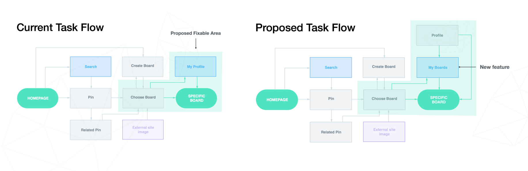
- Pain Point #1: Users have trouble navigating to their board after they have completed adding pins to it.
- Pain Point #2: It’s difficult to find specific boards even while on the boards/profile page.
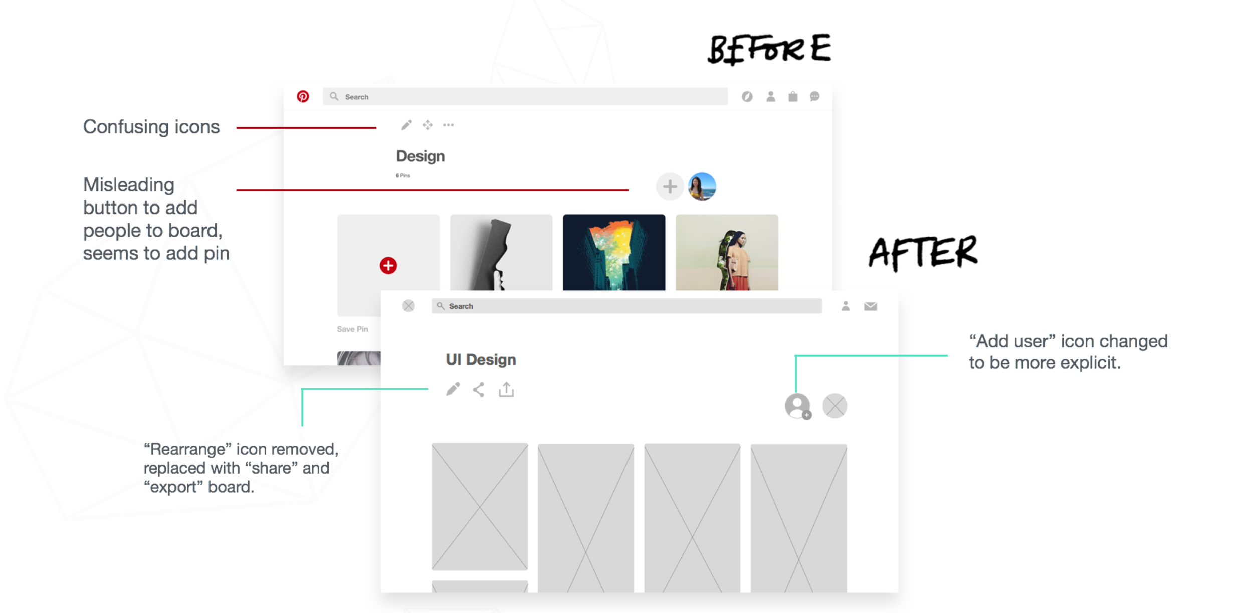
- Pain Point #3: There is confusion about what several icons mean.
Based on these insights, I created a table to help quantify the results of my design changes, and developed a user flow.


IDEATE
- Pain Point #1: Users have trouble navigating to their board after they have completed adding pins to it.
- Proposed Design Change #1: Have boards easily accessible on a drop down menu under the profile icon.
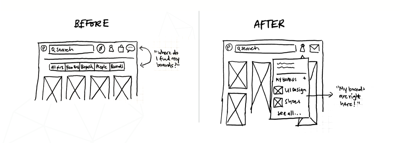
- Pain Point #2: It’s difficult to find specific boards on the boards/profile page.
- Proposed Design Change #2: Add time/alphabetical filters and timestamps to boards.

- Pain Point #3: There is confusion about what several icons mean.
- Proposed Design Change #3: Update icons to more universal meanings, remove anything ambiguous or cursory.


Wireframes: Main Navigation

Wireframes: Boards Page

Wireframes: Individual Board Page
Wireframes: Individual Pin Page

Solution: Icon Set

Next we tested the prototype on a new batch of target users.

Revised Navigation Bar

Final Prototype
OUTCOME
In the final round of testing, it was found that most of the users were able to complete the three tasks successfully.

conclusion
In retrospect, narrowing down the most crucial issues to tackle first was the key challenge. Given the broad variety of Pinterest users, it was also tricky narrowing down the solution to just one segment. While the three pain points covered are focused on general web platform usability, some issues uncovered in my initial research I would like to tackle at later stages are: improving the Promoted Pins experience for users, developing an exportable mood board feature, improving the experience of uploading native content, and a more cohesive content strategy.